
Background
-
Project Overview
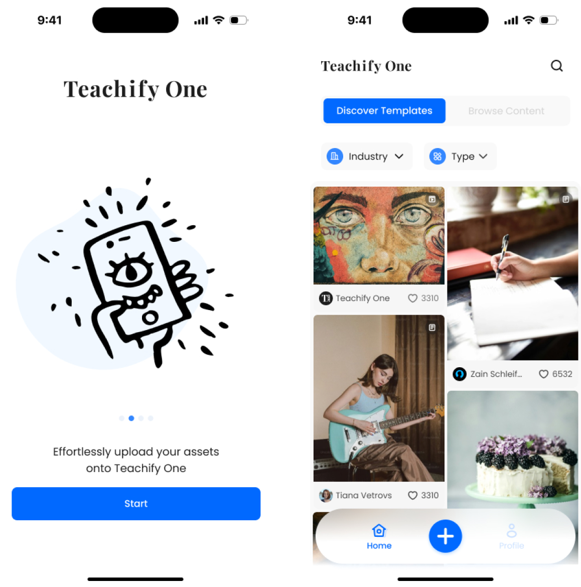
Teachify One is a content creation platform tailored for beginner creators, integrating platform, tools, and community elements. Its goal is to simplify the content creation process, boost productivity, and provide diverse ways for creators to showcase their work.
-
My Role
UI Designer — Lead of UI design
-
Time
8 weeks - UX & UI Design
4 weeks - UI Redesign
Predicted Outcome
-
100K+
Downloads
-
10+
Benefiting Countries
Teachify One empowers content creators to share knowledge globally. With intuitive tools for course creation and audience management, we aim to reach over 100K downloads and positively impact 10+ countries. By targeting key markets, our platform ensures widespread access to quality education.
Jump to Final Design arrow_downward-

The Core Challenge
How can we empower content creators to share and monetize their content more effectively while overcoming common barriers like time constraints, limited resources, and insufficient rewards?
-

The Goal
- Increase registration numbers
- Boost file upload volume
- Enhance digital file transaction volume
Understand the Problem
User Research
Interviews with 8 full-time creators revealed the following common pain points:
-
1No Time
The Battle Between Creativity and Time
-
2No Resource
Lack of Additional Manpower
-
3No Rewards
Lack of Extra Incentives
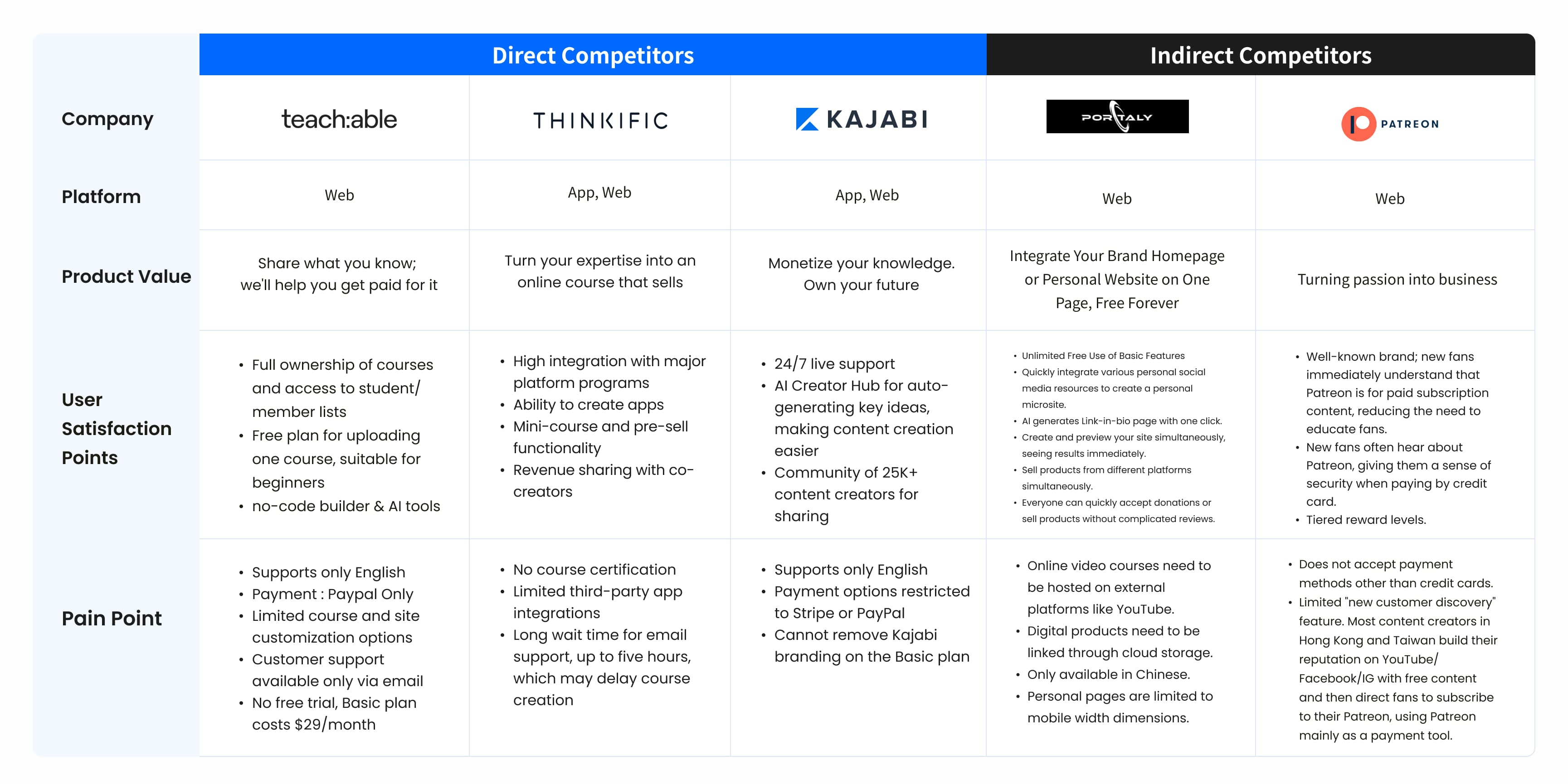
Competitive Analysis
An in-depth analysis of direct competitors (Teachable, Thinkific, Kajabi) and indirect competitors (Patreon)
Product Strategy
PM and our team member primarily conducts business analysis and discusses product strategy.
User Journey Map & Opportunity Points
This User Journey Map outlines the key stages of a creator’s interaction with Teachify One, from initial discovery to content monetization. The journey was carefully mapped to align with our core product goals
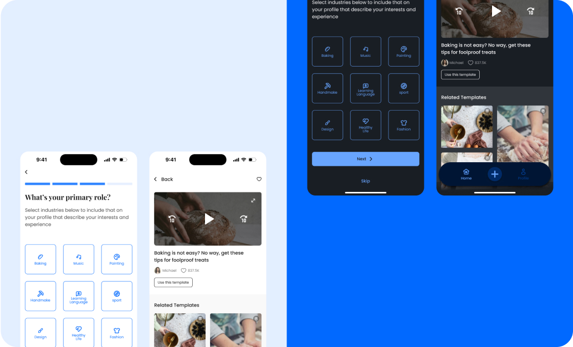
Wireframe & Usability Study

Wireframes
After completing all user interviews, our UX design team created wireframes based on functional blocks, dividing the entire process into three core parts:
-
49 screens
4 prototypes
-
1 rounds of tests
13 participants
User Testing
After completing the initial wireframe, we organized a round of user testing, inviting target users to interact with our prototype. This testing helped us gain a deeper understanding of the issues users encountered during actual use. Based on their feedback, we made critical adjustments to the user scenarios and features to ensure the final product better meets user needs and enhances the overall user experience.

Accessibility considerations
-
1Provide Dark Mode
A dark background can significantly reduce eye strain and discomfort caused by bright light
-
2Adhere to WCAG Colour Contrast Standards
This helps users with visual impairments to better read and understand information on the interface, improving text readability
-
3Optimize Search Filters and History
Enhances the usability of the interface, considering users who may require less physical effort or cognitive load
Finalize & Prototypes

Prototype
Feature
-
- Personalized Onboarding
- Template Browsing & Recommendations
- Batch Content Upload with AI Suggestions
- Editing Tools
- One-Click Sharing & Multi-Platform Distribution
- Revenue & Performance Analytics
Design System
After multiple design discussions, we decided to use Teachify's original brand colors to reduce development costs. We also organized the components that will be used in the design. Since we are working as a team, this highlights the importance of overall consistency.
User Feedback
During our user testing phase, we gathered valuable feedback from users, which is crucial for the iterative improvement of our product. The actual experiences and suggestions from users helped us identify several areas for enhancement. This not only improved the product's usability and functionality but also increased overall user satisfaction. These positive feedbacks demonstrate our team's commitment to enhancing user experience and have guided subsequent design directions and feature optimizations.

Takeaways
In this project, I collaborated with designers from diverse backgrounds to develop a new product. We conducted user research, explored design styles, and performed competitive analysis while holding regular meetings to ensure progress. This collaboration deepened my professional skills and teamwork understanding, with disagreements resolved through fair, rational discussions.
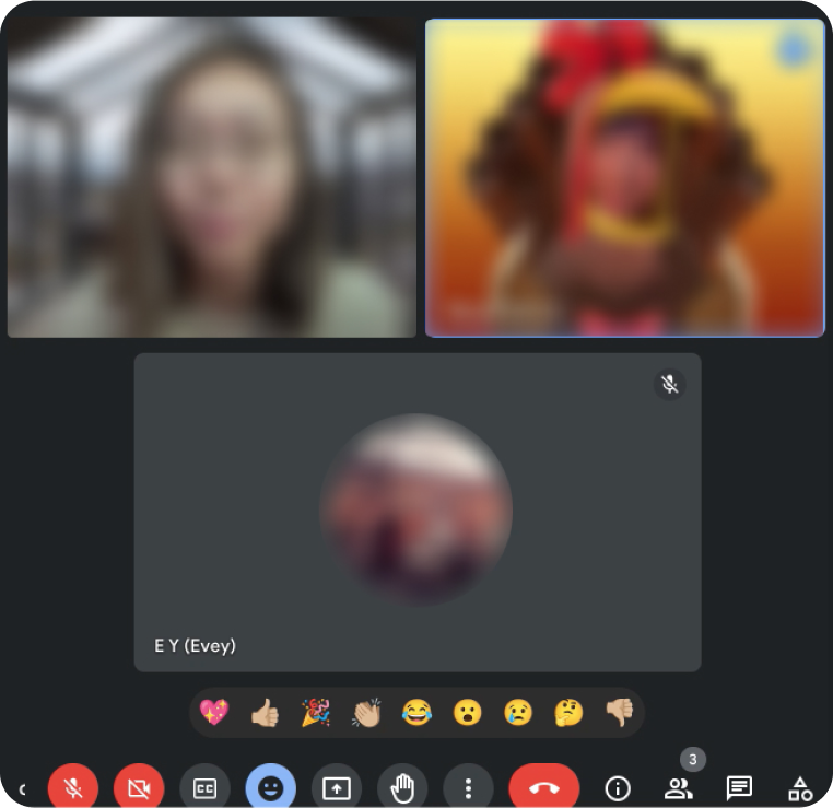
During the design competition, our team received valuable feedback from senior designer judges. After the event, I refined the design based on their suggestions, focusing on enhancing user experience and visual clarity. The images on the right is the comment context from our senior designer judges.