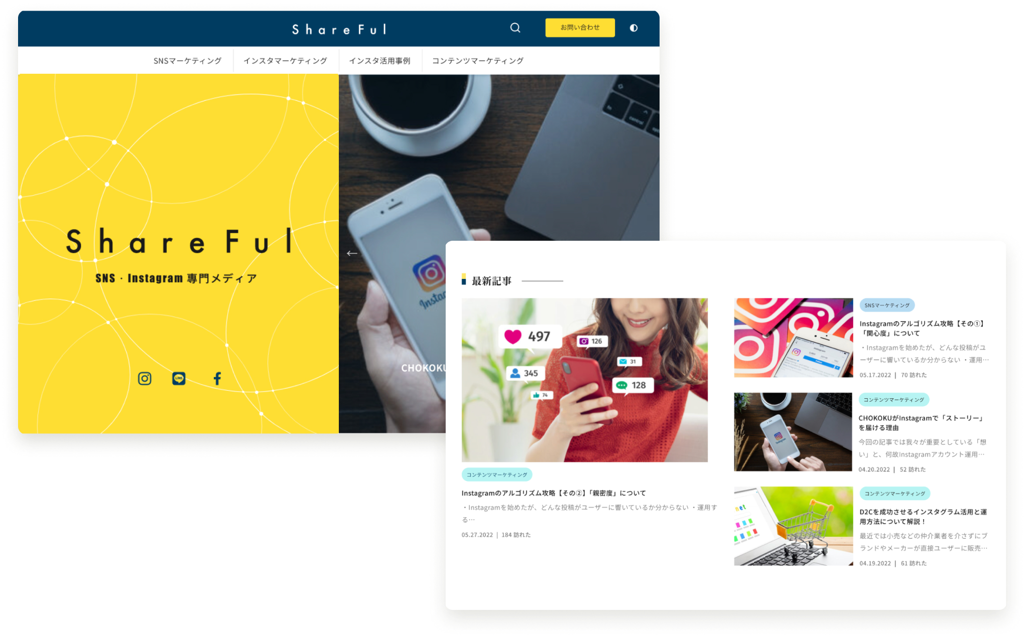
Project Overview
This website provides information and articles that are useful for learning about operating it as an owned media, as well as understanding the significant impact and effective use of social media.
The problem
- Not leading to user inquiries
- Lack of clear hierarchy in the content text of the articles
- Weak CTA design
- Absence of a strong brand identity
- Lack of a clear primary purpose for the website
The goal
- Increase inquiries from potential target customers
- Create a new website that is convenient, intuitive, fresh, enjoyable, and innovative
- Enhance the brand image of Shareful
Target User
- Ages 25 to 45
- Individuals working in SNS or PR departments
- All genders
Impact
Collaboration was at the heart of our design process. We engaged in extensive discussions and cooperation with our internal team members and superiors to refine the design direction based on the insights gathered from our user research. These interactions were crucial in aligning our objectives and ensuring a user-centric approach. Through a collective effort, we addressed design adjustments and modifications, optimizing interfaces and functionalities.
Jump to Final Design arrow_downwardUser Reseach
Early User Research (Using Google Analytics)
In the initial phase of the project, we leveraged Google Analytics to gain valuable insights into user behavior and traffic patterns. This data-driven approach allowed us to track metrics such as website visits, page views, and bounce rates, providing us with a comprehensive view of how users interacted with our platform. Through this analysis, we identified key user needs and pain points, shedding light on areas that required improvement. User reactions and feedback on various pages and features were instrumental in shaping our design direction.
The Pain Point
-
1Experience
Insufficient knowledge in account management
-
2Time
Lack of time to learn about account management
-
3Result
Spending time on ineffective posts
Persona
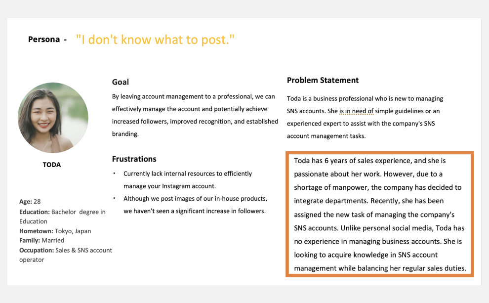
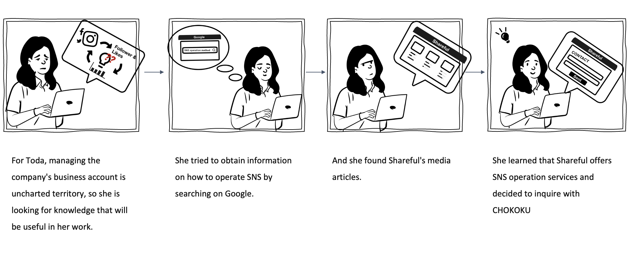
User Journey Map - Route 1
Goal: Acquireing knowledge and support for effectively managing the company's business account on social media platforms.
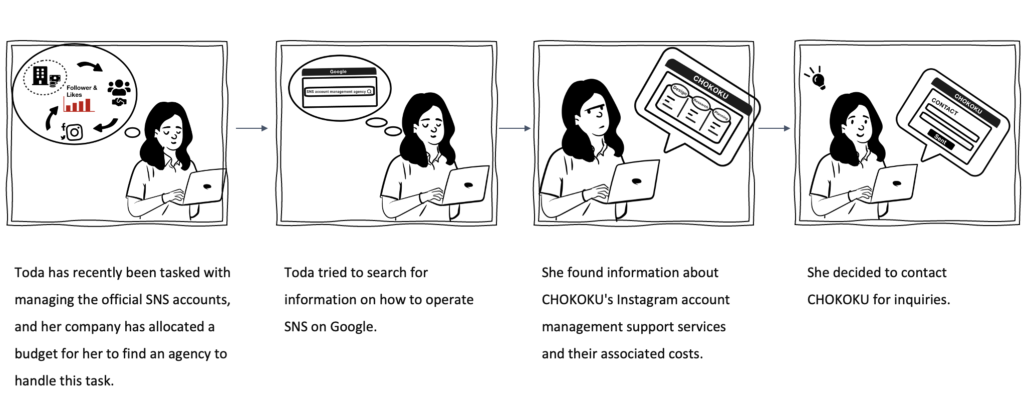
User Journey Map - Route 2
Goal: The goal of the user journey is to identify and select a suitable agency, like CHOKOKU, to handle the management of the company's official SNS accounts within the allocated budget.
User Journey Map - Expecting Result
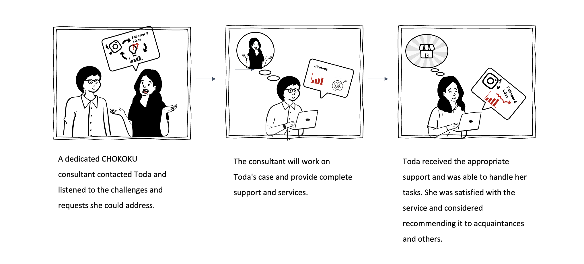
Goal: The dedicated CHOKOKU consultant provided tailored support and services to Toda, addressing her challenges and meeting her requests. Toda successfully managed her tasks with the assistance received and expressed satisfaction with the service. She even contemplated recommending it to acquaintances and others due to the positive experience.
Informative Structure
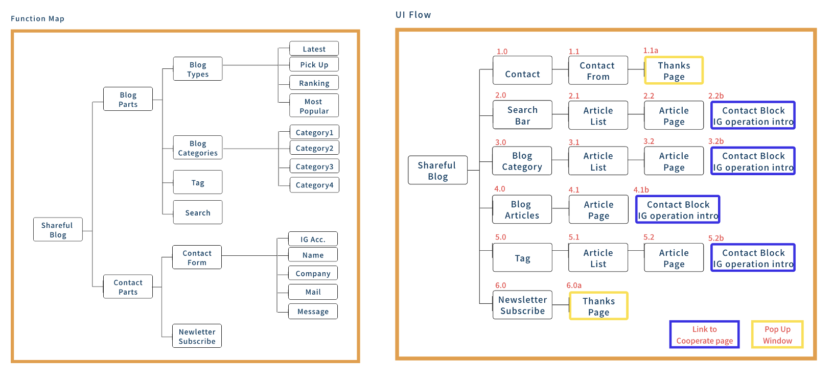
Function Map & UI Flow
Starting Design
Moodboard
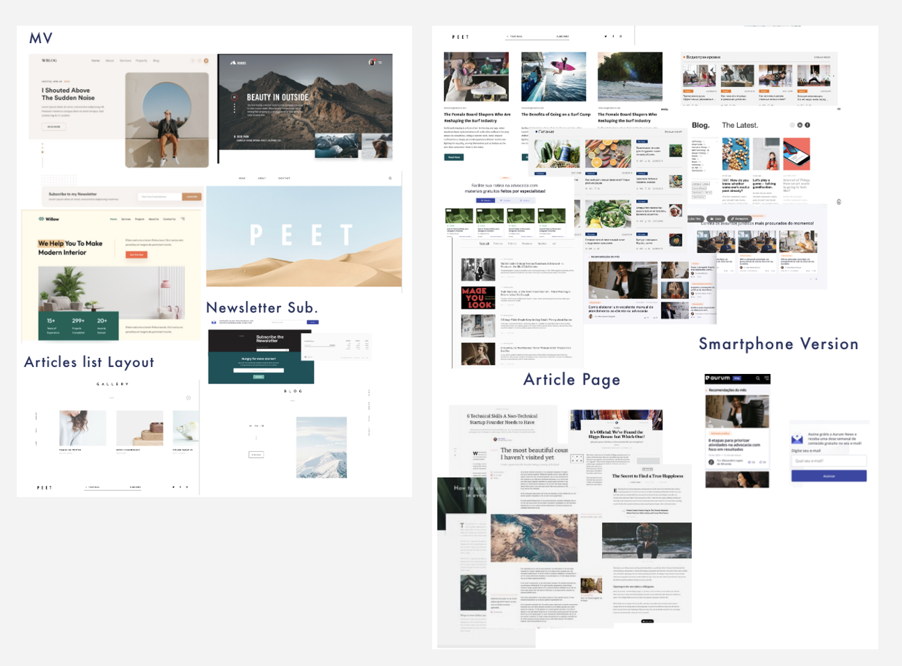
I searched numerous overseas and Japanese blog pages to extract layouts and styles suitable for Shareful. The mood board style also aligns with the target age group of 25-45 years.
Style Guide
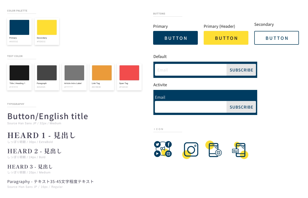
Utilizing the CHOKOKU logo color as the foundational shade for cohesiveness, we delve into the color psychology of blue. Blue often conveys attributes of stability, reliability, and productivity, but it can also evoke emotions of sadness, aloofness, and distance. In contrast, yellow radiates creativity, brightness, light, vitality, energy, optimism, and a desire for growth and distinction. It is renowned for being attention-grabbing, yet, considering the abundance of articles on this blog website, an excessive use of yellow could potentially overwhelm and fatigue the users.
Wireframe to Mockup
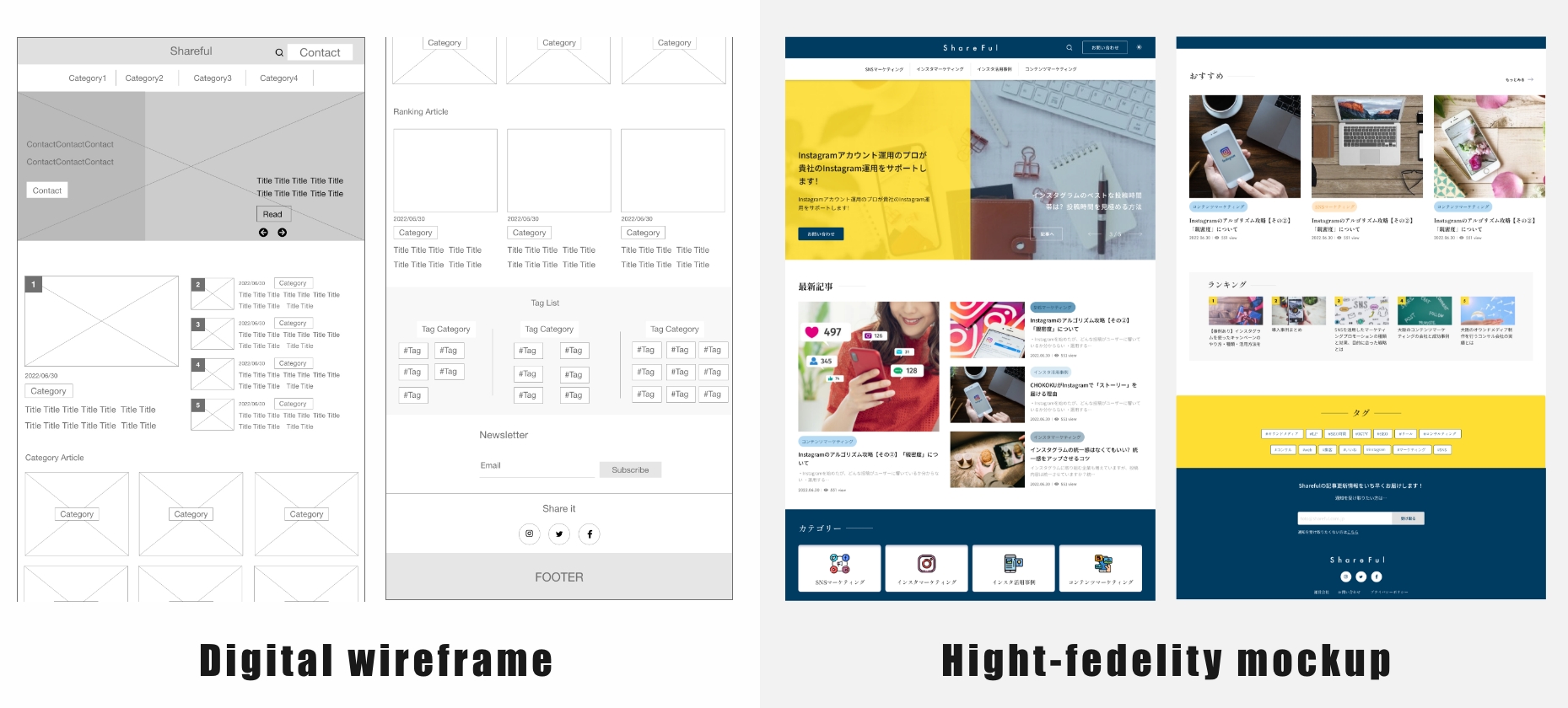
To create more white space and improve overall design aesthetics, I made layout adjustments as I transitioned into the high-fidelity phase. These changes aimed to prevent overcrowding in each section, ensuring a balanced visual composition. Additionally, I aimed to avoid excessive repetition in layout, resulting in slight variations in the arrangement of each content block. This approach maintains a sense of diversity in design while preserving a cohesive and organized appearance.
Usability Study
Mockup Usability Study
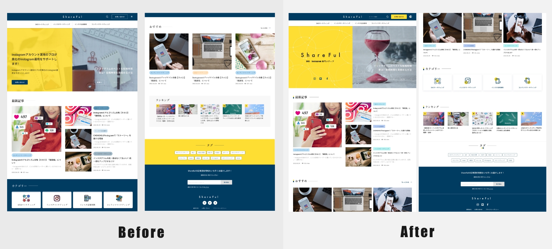
In the second phase of high-fidelity design, multiple discussions within the company led to decisions on which content should be presented on the first page. The overall MV was also adjusted for improved usability. Specifically, we addressed the issue of redundant buttons in the same section, such as the contact buttons appearing twice, and the "read more" button for articles on the right. To enhance user clarity and streamline the design, we opted to omit the buttons in the MV. Instead, we incorporated SNS icons for quick access to our various communication channels, optimizing user engagement through multiple touchpoints. Additionally, we made colour adjustments in the header buttons to create a more distinct contrast, and fine-tuned colours in other sections to achieve a lighter and more cohesive visual presentation.
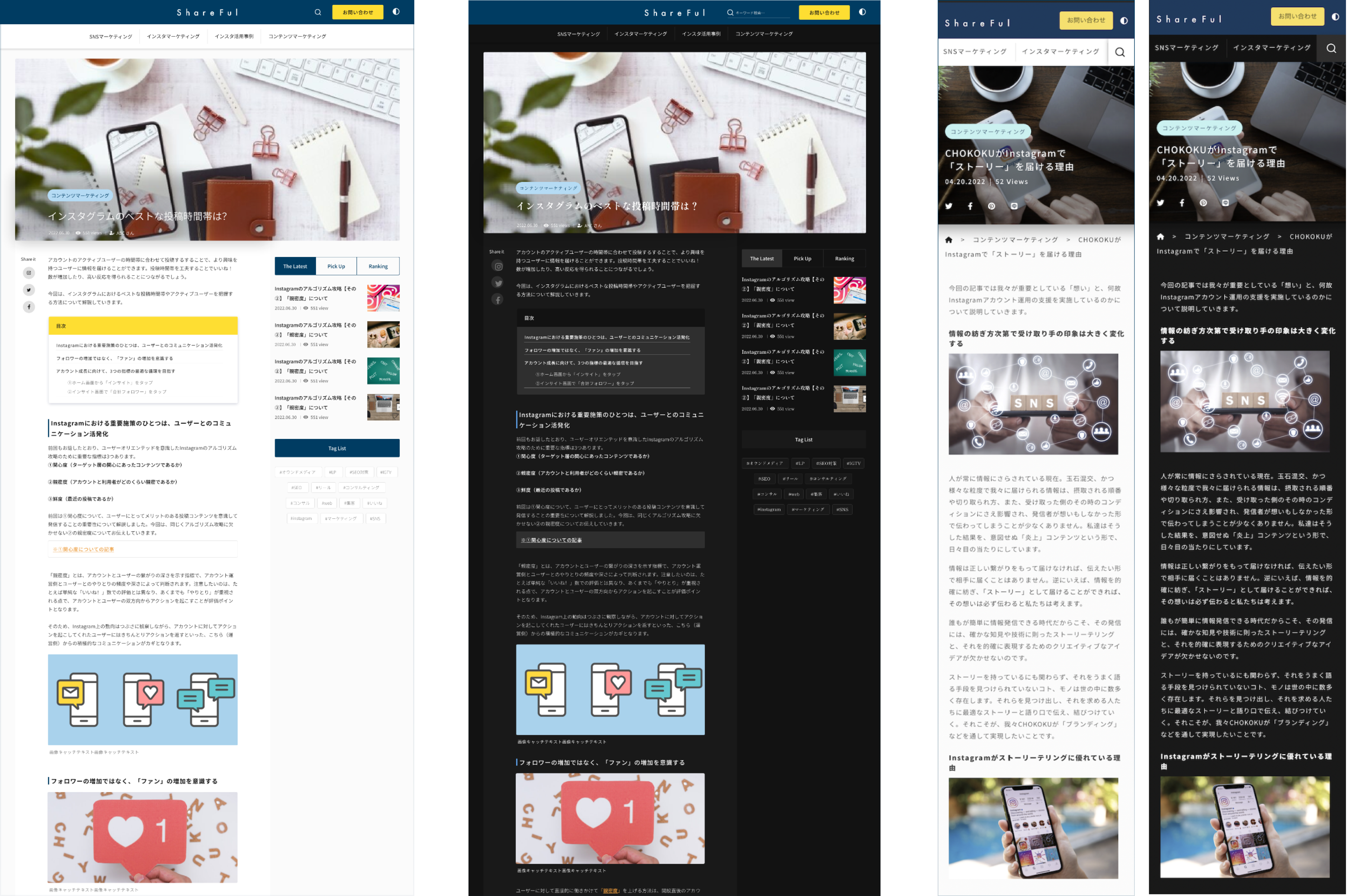
Day & Dark Mode
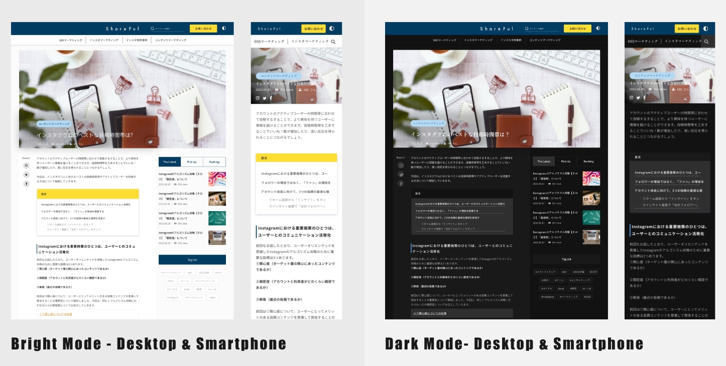
Due to the significant mobile user audience, we have introduced a new feature - a dark mode. This addition allows users to switch to a preferred reading mode, accommodating their preferences and enhancing the overall user experience.
Accessibility considerations
-
1Users with Visual Sensitivity
Daylight mode, designed for users sensitive to brightness and contrast, enhances visual comfort and energy efficiency, reducing eye strain in low-light conditions.
-
2Personalized Choice
Offering both daylight and night modes accommodates diverse user preferences, enhancing accessibility.
-
3Cognitive Accessibility
Design clear and intuitive user interfaces and navigation structures to help users with cognitive limitations better understand and use the application.
Final Design
Takeaways
What I learned
The importance of teamwork and consensus building throughout this phase cannot be overstated, as it played a pivotal role in shaping our final design solution, ultimately meeting user needs and exceeding company goals.

