
Background
-
Project Overview
OK Tech is a volunteer-driven international community for designers and developers based in Kansai region. In late 2024, the team initiated a website redesign to improve clarity, strengthen identity, and increase awareness of its existence.This project was less about “designing pages” and more about structuring direction in ambiguity.
-
My Role
I contributed as a product-focused UX collaborator, working across research, information architecture, visual system design, and cross-functional alignment within a decentralized team.
-
Time
Nov. 2024 - Oct. 2025
Final Outcome
Redesigned and relaunched OK Tech’s official website in November 2025.
・Successfully relaunched the community website
・Clarified community identity
・Improved event discoverability
・Introduced scalable design system
・Hosted release presentation within community
The Context
Undefined Product Positionin
The website lacked a clearly defined role within the ecosystem.
-
1Undefined Product Positioning
The website lacked a clearly defined role within the ecosystem.
-
2Fragmented Journeys
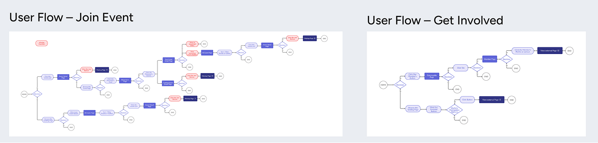
User flows were redirected externally, breaking continuity.
-
3No Product Governance
No centralized ownership or alignment across contributors.
Research & Problem Framing
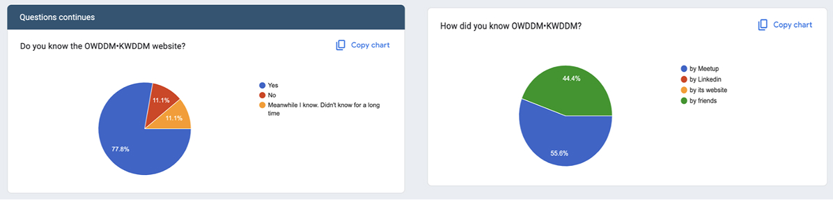
To better understand how the website functioned within the community ecosystem, we conducted a lightweight survey among active members and contributors.
Key Insights
-
1
Discovery happened externally
55.6% discovered the community via Meetup and 44.4% through friends.
The website was not a primary acquisition channel. -
2
Engagement was event driven and Discord centered
Most members participated through events (88.9%) and continued engagement via Discord (88.9%).
The website functioned more as a reference than an active platform. -
3
The design was simple — but emotionally flat
While many users described the site as “simple,” it was also perceived as “boring” or “cold.”
Clarity existed, but identity and warmth were lacking.
The website functioned more as a reference than an active platform.
Problem Reframing
The challenge, therefore, was not simply visual redesign. It was redefining the website’s role within the community experience.
Defining Core User Journeys
Based on the research signals, it became clear that the website needed to support specific user intentions rather than act as a general information container.
I synthesized the findings into three primary motivations:
-
1
Find upcoming events
Users primarily engaged through events. Event discoverability needed to be central and frictionless.
-
2
Explore past activities
The website had archival value, but lacked structure to showcase community history effectively.
-
3
Understand the community and how to get involved
New visitors needed clarity:
Who is this community for?
How can I join?
What can I contribute?
By defining these core journeys, the redesign shifted from rearranging pages to restructuring task priority.
The question was no longer “What content should we display?”
It became “What actions should the platform enable?
Information Architecture Redesign
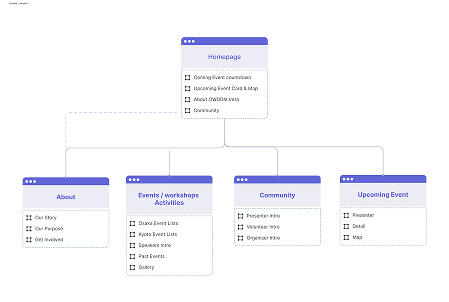
To align the website with actual user motivations, I restructured the information architecture.
The previous structure reflected accumulated content rather than task clarity.
The redesign focused on:
-
・Prioritizing upcoming events
・Separating identity from participation
・Simplifying content hierarchy
I mapped the structure based on user intent rather than existing content grouping, transforming the homepage into a functional hub.
Brand Evolution & Governance
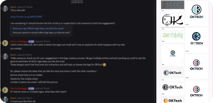
During the redesign, the community initiated a name and brand update. As a decentralized, volunteer-driven organization, decisions were distributed across contributors. Logo proposals were submitted by members, and the final direction was selected through community voting. In this environment, alignment mattered more than control. My role was not to dictate brand identity, but to ensure that evolving decisions remained coherent with the platform’s structural direction and user experience.
Collaboration with Engineering
Engineering began prototyping directly in code before visual direction was finalized. In a decentralized, volunteer-driven environment, design and development progressed in parallel requiring alignment rather than traditional handoff.
The collaboration evolved through:
Instead of controlling execution, I focused on maintaining structural clarity across iterations.
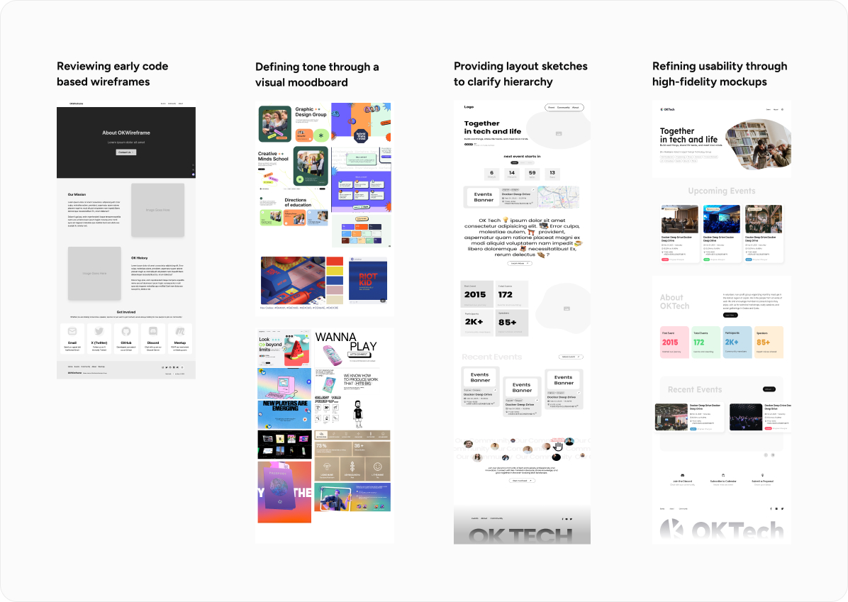
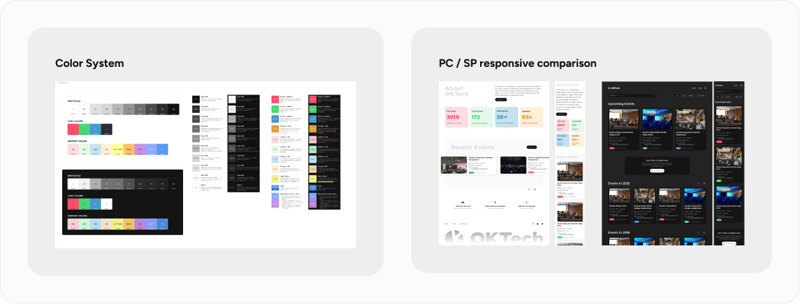
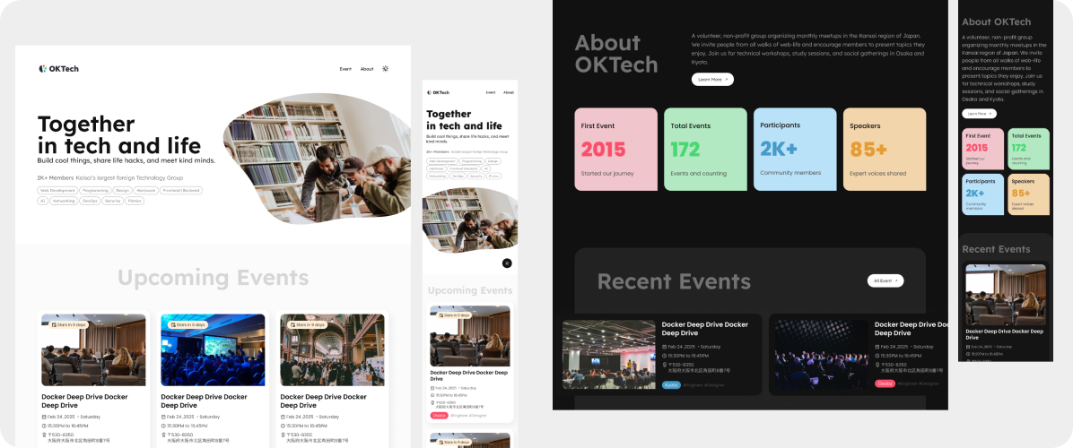
Systemization & Scalability
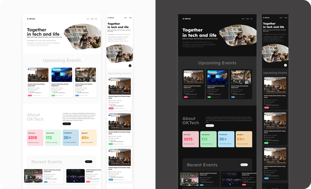
Rather than refining individual screens, I established a consistent design foundation across the platform. By standardizing components, supporting light/dark modes, and ensuring responsiveness across desktop and mobile, the system became easier to maintain and scale for future contributors.
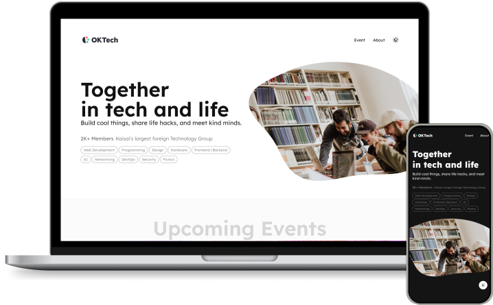
Final Design
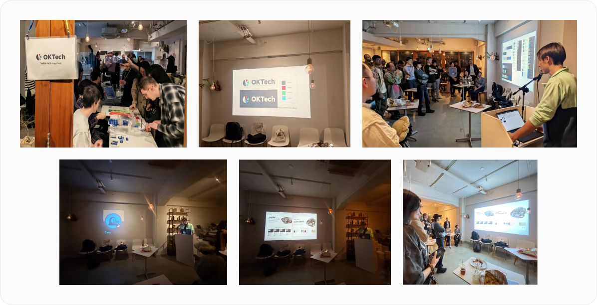
Release & Community Adoption
The redesigned website was launched in November, accompanied by a community presentation to introduce the new structure and visual direction.
Takeaways
What I learned
In this project, I had the privilege of collaborating with engineers from diverse backgrounds to develop a new product. Throughout the process, we worked closely together, held regular meetings to discuss progress, conducted user research, explored design styles, and performed competitive analysis. Each step not only deepened my understanding of teamwork but also enhanced my professional skills. Although we occasionally had disagreements during the collaboration, we always resolved them in a fair, reasonable, and rational manner. This experience has given me a profound appreciation for the power and beauty of teamwork.
Community Response
After launch, the feedback was quietly affirming.
At the release meetup, several volunteers including some I had never met before expressed appreciation for the clarity and effort behind the redesign.
An engineer also acknowledged the level of initiative reflected in our ongoing discussions throughout the process.
These reactions signaled something meaningful:
the website was no longer just a static presence, but something the community genuinely recognized and valued.